
Introduction
Elementor Pro’s built-in form builder is perfect for most simple use cases, offering basic styling capabilities. However, in certain scenarios, additional custom code may be necessary to achieve specific functionalities.
The Challenge: Placeholder for select fields
By default, Elementor’s Pro Form’s select fields lack placeholders, unlike other input fields. This isn’t a problem specific to Elementor but is related to the nature of group fields in HTML.
In this guide, we’ll tackle the challenge of adding a placeholder to the required select field.
Step-by-step solution
Creating a Required Select Field
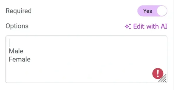
To set up a required select field, you simply need to toggle the “Required” option. But, the trouble is that it selects the first option by default which defeats the purpose of a required input.

To prevent a default selected option, we add an invalid option that prompts users to make a selection to avoid form errors. This is achieved by adding a blank space as the first option of the select field.
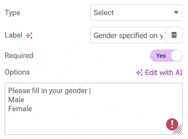
Adding a placeholder
To further improve user experience, we can replace the blank space with a key-value pair, where the key is our placeholder text and the value is blank. In Elementor form terms, the option should be as “placeholder text | .”
Addressing accessibility concerns
While the above method works, the invalid option remains selectable and is read by screen readers as one of the options. To prevent this, we need to add two attributes, “hidden” and “disabled” to the option. Unfortunately, Elementor currently does not natively support adding custom attributes, so we turn to Custom JS.
Implementing custom JS for accessibility
To ensure the placeholder option cannot be selected, follow these steps:
- Add a class name of “
dd-ele-form” to your form widget. - Insert the following JS Snippet using your preferred method such as a Code Snippets plugin, an HTML widget or enqueuing the script in your child theme.
<script>
document.addEventListener('DOMContentLoaded', function () {
    // Find all forms with class name "dd-ele-form"
    var forms = document.querySelectorAll('.dd-ele-form');

    // Iterate through each form
    forms.forEach(function (form) {
        // Find all select fields with the required attribute within the form
        var selects = form.querySelectorAll('select[required]');

        // Iterate through each select field
        selects.forEach(function (select) {
            // Check if the first option has a blank value before disabling and hiding it
            if (select.options.length > 0 && select.options[0].value.trim() === '') {
                select.options[0].disabled = true;
                select.options[0].hidden = true;
            }
        });
    });
});
</script>
Using Modern JS Syntax
<script>
document.addEventListener('DOMContentLoaded', () => {
    // Find all forms with class name "dd-ele-form"
    const forms = document.querySelectorAll('.dd-ele-form');

    forms.forEach(form => {
        const selects = form.querySelectorAll('select[required]');

        selects.forEach(select => {
            if (select.options.length > 0 && select.options[0].value.trim() === '') {
                select.options[0].disabled = true;
                // Optionally add CSS for better UX:
                select.options[0].style.display = 'none';
            }
        });
    });
});
</script>
Conclusion
By following these steps and implementing the provided Custom JS, you’ll add a placeholder to your Elementor Form’s Select Field. If you have a better solution, please leave them in the comments section.
Hi Daveden,
thank you so much for this really helpful script. May I ask you, how can I use a second class for e.g. another form on this page or at least can I delete the class and use all forms without a class?
var forms = document.querySelectorAll(‘.dd-ele-form’);
Hi Stefan
I’m glad that you found the article helpful. You can reuse the same class name (‘dd-ele-form’) on multiple forms on the page and it would work just find. You don’t have to rewrite the javascript.
If you want it to work on all Elementor forms on your page, then you can replace (‘.dd-ele-form’) with (‘.elementor-form’).
Hello,
Good article, very helpful.
Given your example and code, how can I change only the placeholder text color for the select field? I have tried several different CSS solutions, but they don’t seem to work – thank you.
Thanks so much this is very helpful. i have had thie problem for quiet a while but today its no more a prob
Hi David! Thanks a lot for this snippet, really helpful!
But I have an issue. Maybe you could help, any idea why this doesn’t work fully on a popup?
If I leave the snippet just like you shared, In a form that it’s on the front page it works perfectly, but if the form is on a popup (Elementor), the placeholder doesn’t show (it’s hidden and disabled).
My solution was to set disabled to “false” state. but hidden leave it “true”, so the user can’t select that option, but appears as a placeholder, If the user doesn’t change the selection, the placeholder it’s used as an answer.
Thanks again!
Thanks for letting me know. I’ll have to look into it. But generally, JavaScript don’t work properly inside popups because the Popups themselves are created using JavaScript. I remember seeing a tutorial by Uriel Soto which you can check out. Maybe it’ll help you out – https://urielsoto.com/how-to-run-javascript-on-your-elementor-popup/