Elementor CSS grid: Create a flexible boxed/stretched two-column layout

Introduction
This updated tutorial demonstrates how to create a visually striking two-column layout in Elementor. With this technique, your text content remains neatly contained within the standard boxed content area, while the accompanying image stretches to the edge of the screen.
This layout is perfect for highlighting the featured image, adding visual interest to your page, and guiding the user’s eye.
What you’ll need
- The latest version of Elementor. You may also need Elementor Pro to customise the layout per section.
- Basic understanding of HTML and CSS (helpful but not essential).
How it works
We’ll achieve the layout using a combination of:
- Elementor’s Flexbox Container: To set up the basic two-column structure.
- CSS Grid and Custom Variables: To control the column widths and create the stretched effect.
- BEM naming methodology: For well-organised and reusable CSS classes.
- Elementor Custom CSS: To optionally change a few properties like the ratio of left to right column per section
Steps
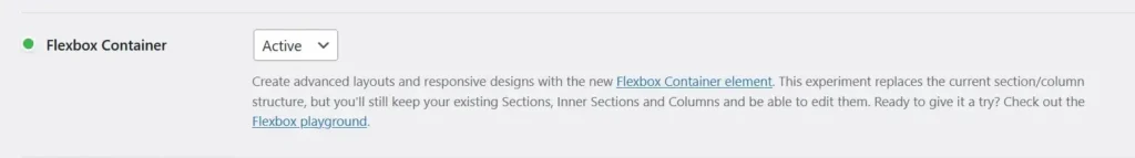
Activate the flex container feature
The Flexbox Container feature should be active by default on new Elementor websites. But if it isn’t active on your site, you can activate it by navigating from your WP Dashboard to Elementor > Settings > Features and activate Flexbox Container.
Set up the base layout
- Create a new two-column flexbox layout in the Elementor edit page.
- Set the content width of the container to full width
Parent Container Properties
- On the parent container, change the content width from “Boxed” to “Full Width”.
- Leave the Width as the default 100%
- Set the Column Gap to 0
- Set the Row Gap to your preferred gap which would separate the Image and text content on mobile.
- Set the left and right Padding to 0
- Add a class name of “
dd-mixed-grid“
Child Grid Container Properties
For the child containers, we’ll employ a BEM naming methodology to determine the position of the child item, as well as whether it is boxed or stretched.
The naming convention is as follows: the block name is “dd-mixed-grid“, then the element name can either be __col1 or __col2 depending on whether it should be in the first or second column. Finally, apply a modifier of --full if you want the content to extend to the edge of the screen. I show how it is implemented in the YouTube tutorial.
Custom CSS
Finally, apply some Custom CSS using your favourite method for organising your code snippets. The snippet is divided into two sections. The first section is the general CSS that would affect all the required sections on the page.
The second portion is the modifier CSS that is added to each section and controls the properties specific to each section.
Assign grid children to specific columns using the named grid lines. There are 6 named grid lines available:
grid-column: full;For a fullwidth child containergrid-column: content;For a content-width containergrid-column: col1;For Boxed First Columngrid-column: col2;For Boxed Second Columngrid-column: col1-full;For Stretched First Columngrid-column: col2-full;For Stretched Second Column
Site-wide CSS
/*-- Site-wide CSS --*/
.dd-mixed-grid {
    --_dd-content-max-width: var(--dd-content-max-width,1360px);
    --_dd-col1-pct: var(--dd-col1-pct, 40);
    --_dd-gap: var(--dd-gap, 20px);
    --_dd-gutter: var(--dd-gutter, 10px);
    --dd-col1-width: min((var(--_dd-col1-pct) * (100% - var(--_dd-gap) - 2*var(--_dd-gutter)) / 100), (var(--_dd-col1-pct) * (var(--_dd-content-max-width) - var(--_dd-gap)) / 100));
    --dd-col2-width: min(((100 - var(--_dd-col1-pct)) * (100% - var(--_dd-gap) - 2 * var(--_dd-gutter)) / 100), ((100 - var(--_dd-col1-pct)) * (var(--_dd-content-max-width) - var(--_dd-gap)) / 100));
    --dd-grid-cols: [full-start col1-full-start] minmax(var(--_dd-gutter), 1fr) [col1-start content-start] var(--dd-col1-width) [col1-end col1-full-end gap-start] var(--_dd-gap) [gap-end col2-start col2-full-start] var(--dd-col2-width) [col2-end content-end] minmax(var(--_dd-gutter), 1fr) [col2-full-end full-end];
    display: grid;
    column-gap: 0;
    grid-template-columns: var(--dd-grid-cols);
    grid-auto-flow: row dense;
    width: 100%;
    max-width: min(100%, var(--dd-body-max-width));
    padding-inline: 0;
    align-items: stretch;
}
:where(.dd-mixed-grid) > :where(div, p, figure, img, h1, h2, h3, h4) {
    grid-column: content;
}
.dd-mixed-grid__col1 {
    grid-column: col1;
}
.dd-mixed-grid__col2 {
    grid-column: col2;
}
.dd-mixed-grid__col1--full {
    grid-column: col1-full;
}
.dd-mixed-grid__col2--full {
    grid-column: col2-full;
}
.dd-mixed-grid__content {
    grid-column: content;
}
.dd-mixed-grid__full {
    grid-column: full;
}
@media (max-width: 768px) {
    .dd-mixed-grid > :is(.elementor-element, div, section, article, aside, nav, figure, img, p, h1, h2, h3, h4, h5, h6) {
        grid-column: content;
    }
}
Section-specific CSS
This CSS should be added to each parent section. Replace the selector keyword with a class name if you don’t have access to the Elementor Widget Custom CSS area
/*-- Section-specific CSS --*/
selector{
    --dd-content-max-width: 1140px;
    --dd-gap: 0px;
    --dd-gutter: 10px;
    --dd-col1-pct: 60;
}
Mobile Responsiveness
The cool thing about this setup is that on mobile, the columns stack one on top of the other within the content area with the gutter to the left and right of it. So, you don’t need to do any work to make it mobile-responsive.
The only thing you may want to do is set the order of the image on mobile to be at the top by going to the Advanced tab of the Image Wrapper container and setting the Order to First.
2 comments
Hi Dave!
Thank you so much for your tutorial, it’s really helpful!
in the Section-Specific CSS, precisely in the –dd-content-max-width: 1140px I recommend you add the semicolon! I didn’t understand why the site wasn’t working and after a while I found the solution!
Final Results:
selector{
–dd-content-max-width: 1140px;
–dd-gap: 0px;
–dd-gutter: 10px;
–dd-col1-pct: 60;
}
Thanks again for your contribution!
Thanks for the heads up!! I missed that.
Leave a comment
Replying to .
Thanks — your comment is in
It's awaiting moderation and will appear after it's approved and the site is rebuilt.