
Introduction
Ever stared at a huge wall of text on a website, feeling overwhelmed and uninterested? We’ve all been there. That’s where accessible headings come in – your secret weapon for creating websites that are easy to read and search engine gold.
Think of headings like chapter titles in a book, breaking up long content and guiding readers through the content with ease. They are also great for SEO because they provide vital information about your page’s structure and relevance.
Mastering the art of headings
The hierarchy
Just like a well-structured book, your web page has its hierarchy. The <h1> heading serves as the big, bold, main title at the top, either in the header or the hero section, grabbing the reader’s attention and setting the stage – equivalent to a book title. A user would typically look at your H1 title and decide if it is worth continuing down the page.
Going down the hierarchy, we have Section titles (<h2>), similar to chapter titles in your book, introducing the key sections of the page like “services” or “testimonials”. Then deeper within each section, we have subtopic titles (<h3>) which further breaks up the section to highlight specific subtopics. Thereby, creating an overall structured content that is easy to read or skim through.
Remember these golden rules
- One H1 per page: Just like a book has one main title (on the cover page), your page should have one clear and concise main title represented by an
<h1>. See MDN for more information. - Sequential and logical heading levels: Maintain a logical sequence, starting with
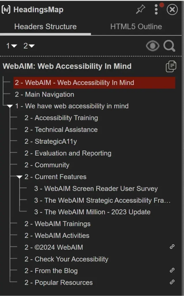
<h1>for the main title, <h2>for section titles,<h3>for subtopics, and so on. Don’t skip heading levels unless moving to a new higher-level section. One nice tool for checking heading levels is the HeadingsMap Chrome extension - Content First, Styling Later: Let your headings guide content, not the other way around. Use CSS for styling, don’t use a heading tag simply to make a portion of text look bigger!
- Short and sweet: Keep headings descriptive and concise. Think cliffhangers, not full plot summaries. Use headings to help the user predict the content that follows. This improves readability, especially for those with reading difficulties or limited short-term memory. If it takes up more than eighty characters, then it is probably better suited as a paragraph text than a heading.
- Content, please!: No empty chapters! Each heading deserves supporting content, or it might as well be a paragraph. Imagine opening a chapter in a recipe book that says “How to make an Omelette”, only to find that the content is blank! Wouldn’t you say that the book is unfinished?
Other things to know
- H1 may not be the first heading: In some scenarios, like e-commerce websites, you might see
<h2>headings before the <h1> to provide context to a region or list of items like the sections in a mega menu or to label navigation lists outside the <main> content area. Those headings tend to get repeated across multiple pages and are exceptions to the rule about sequential heading. So, in my opinion, any heading after the<h1>heading and within the<main>content area should follow sequentially. See an example on W3C - Hidden headings for context: Sometimes, we use hidden headings, to provide meaning to page regions for screen reader users. For example, you might find hidden headings coupled with the “aria-labelledby” attribute being used to label the primary navigation, table of contents, footer menu, and other important page sections. This is meant to improve the reading experience for users of screen readers and other assistive technologies.
Styling headings in WordPress
Now, here’s how I typically approach typography settings in WordPress, especially when using Elementor and Bricks.
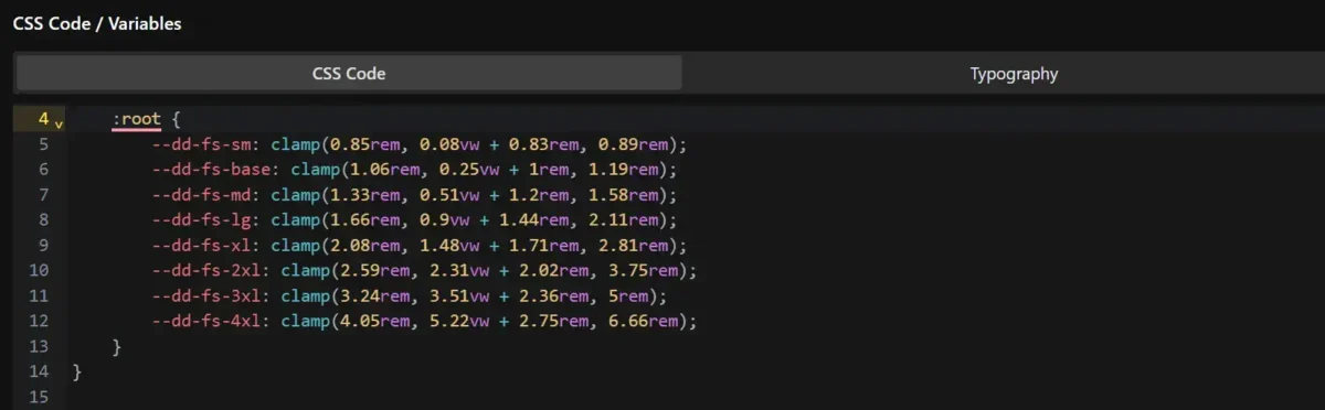
Typography Custom Variables
Create custom variables in CSS for font sizes and styles. You can use online tools like Fluid Type Scale or Utopia Fluid Type Scale Calculator. Imran from Web Squadron also has a calculator that he created.
Theme Styles
Apply styles for <h1> to <h6> tags in your builder’s theme styles. In my opinion, the default theme styles should be used to style your blog posts. Those typically use a single post template and have similar styling for all the different posts, so it makes sense to style them on an element level.
My process is to create a style guide page with dummy text containing all the basic elements I might need in a blog post, like containers, headings, paragraphs, links, buttons, lists, etc. and style those using the theme styles.
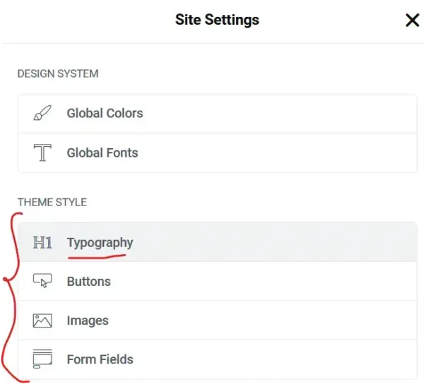
If you are working with Elementor and the Hello Theme, then you’d find these typography settings in the Elementor Site Settings under “Typography Settings”.
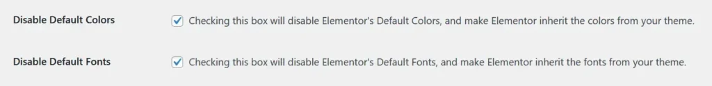
Remember to disable Elementor’s default font and colours by checking the boxes under Elementor > Settings > General.
If you are working with Bricks, then when you open a page to edit, at the top left, you’ll see a cog icon for the settings page. That’s where you’ll see the Theme Styles. The advantage of Bricks builder over Elementor is that you can apply display conditions to your theme styles. So, you can potentially apply one theme style for your blog posts and another for your pages.
Design System Styling
Once I’m happy with the default styling, for my blog posts, then I move on to creating a design system for my pages.
In Elementor, you can do that from the Global Fonts settings in the Site Settings. I create different font sizes from my small to my extra large fonts, making sure to map those to the custom variables I created in my CSS Framework.
Then, as I design my pages, I simply use the global fonts to pick a font that suits the styling of my heading or sub heading for each section.
On the other hand, Bricks doesn’t have a global presets area for typography, but you can easily create utility classes for your different font sizes.
Conclusion
Remember, HTML is for structure, and CSS is for styling. For example, you don’t need to write in “All Caps”. Simply, write your text normally, then use the text transform CSS property in the style tab for to make it uppercase. You can also apply a <strong> tag to convey its importance.
Let’s strive to make the web a better place for everyone!
Great explanation and a very useful resource regarding the Headings and Accessibility.
Thanks Imran! I hope the explanations are clear enough.
As a technical author for over 40 years, I thank you for providing clear guidance on heading structure. I now create websites to keep my mind busy and have seen way too many where headings just seem to have been thrown at the screen. Keep up the good work!
Hi Brian.
Thanks for the encouragement. I hope you enjoy building websites.
Yes, I’ve seen a website where the author used h2 headings for everything on the page including lists. There were no paragraph texts anywhere.