
Introduction
In this updated tutorial to the split grid layout tutorial, I’ll show you how to create a flexible two-column mixed grid layout using Bricks Builder. This layout is perfect for making your featured images pop, guiding the user’s eye, and adding visual impact to your section.
With this technique, your text content remains neatly aligned within the standard boxed content area, while the accompanying image stretches to the edge of the screen. The added advantage is the ability to easily adjust the ratio of the content to image.
What you’ll need
- The latest version of the Bricks Builder Theme
- Basic familiarity with HTML and CSS (helpful, but not essential).
- CoreFrameworks plugin (optional)
How it works
We’ll achieve this layout using:
- Bricks’ standard two-column container structure
- CSS Grid and Custom Variables: To precisely control the placement and layout of the content and image wrapper.
- BEM naming methodology: For organised and reusable CSS.
- Custom CSS: To optionally change a few properties like the ratio of left to right column per section
Steps
Site-wide CSS
If you are using CoreFrameworks, you can apply this CSS and be able to use it both within and outside Bricks. Otherwise, you can also add it directly within the builder or using a code snippets plugin.
/*-- Site-wide CSS --*/
.dd-mixed-grid {
    --_dd-content-max-width: var(--dd-content-max-width,1360px);
    --_dd-col1-pct: var(--dd-col1-pct, 40);
    --_dd-gap: var(--dd-gap, 20px);
    --_dd-gutter: var(--dd-gutter, 10px);
    --dd-col1-width: min((var(--_dd-col1-pct) * (100% - var(--_dd-gap) - 2*var(--_dd-gutter)) / 100), (var(--_dd-col1-pct) * (var(--_dd-content-max-width) - var(--_dd-gap)) / 100));
    --dd-col2-width: min(((100 - var(--_dd-col1-pct)) * (100% - var(--_dd-gap) - 2 * var(--_dd-gutter)) / 100), ((100 - var(--_dd-col1-pct)) * (var(--_dd-content-max-width) - var(--_dd-gap)) / 100));
    --dd-grid-cols: [full-start col1-full-start] minmax(var(--_dd-gutter), 1fr) [col1-start content-start] var(--dd-col1-width) [col1-end col1-full-end gap-start] var(--_dd-gap) [gap-end col2-start col2-full-start] var(--dd-col2-width) [col2-end content-end] minmax(var(--_dd-gutter), 1fr) [col2-full-end full-end];
    display: grid;
    column-gap: 0;
    grid-template-columns: var(--dd-grid-cols);
    grid-auto-flow: row dense;
    width: 100%;
    max-width: min(100%, var(--dd-body-max-width));
    padding-inline: 0;
    align-items: stretch;
}
:where(.dd-mixed-grid) > :where(div, p, figure, img, h1, h2, h3, h4) {
    grid-column: content;
}
.dd-mixed-grid__col1 {
    grid-column: col1;
}
.dd-mixed-grid__col2 {
    grid-column: col2;
}
.dd-mixed-grid__col1--full {
    grid-column: col1-full;
}
.dd-mixed-grid__col2--full {
    grid-column: col2-full;
}
.dd-mixed-grid__content {
    grid-column: content;
}
.dd-mixed-grid__full {
    grid-column: full;
}
@media (max-width: 768px) {
    .dd-mixed-grid > :is(div, figure, img, p, h1, h2, h3, h4, h5, h6) {
        grid-column: content;
    }
}
Set up the base layout
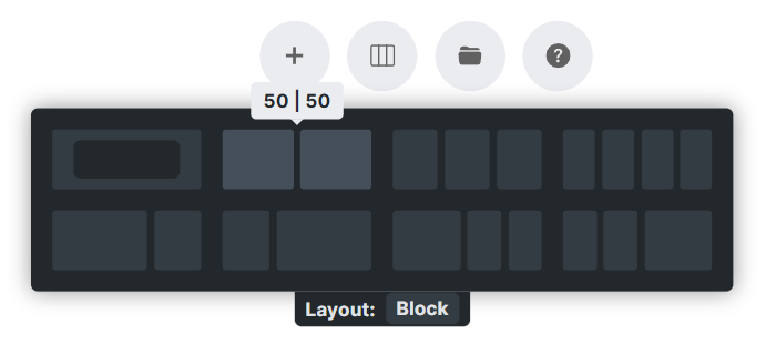
- Create a new two-column container layout within the Bricks’ editor.
- Make sure the parent Section element (if present) has no padding for a true edge-to-edge effect.
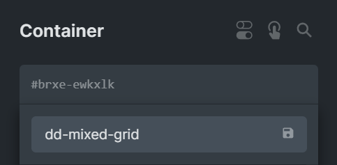
- Add a class name of “dd-mixed-grid” to the parent container.
Container-specific CSS
You can customise each section’s layout by adding the CSS to each Parent Container, either applied to a control class name or using ID styling. Change the values to suit your layout.
/*-- container-specific CSS --*/
%root%{
    --dd-content-max-width: 1200px
    --dd-gap: 0px;
    --dd-gutter: 1rem;
    --dd-col1-pct: 60;
}
Child Grid Columns
For the child containers, we’ll employ a BEM naming methodology to determine the position of the child item, as well as whether it is boxed or stretched.
The naming convention is as follows: the block name is “dd-mixed-grid“, then the element name can either be __col1 or __col2 depending on whether it should be in the first or second column. Finally, apply a modifier of --full if you want the content to extend to the edge of the screen. I show how it is implemented in the YouTube tutorial.
Assign grid children to specific columns using the named grid lines. There are 6 named grid lines available:
grid-column: full;For a fullwidth child containergrid-column: content;For a content-width containergrid-column: col1;For Boxed First Columngrid-column: col2;For Boxed Second Columngrid-column: col1-full;For Stretched First Columngrid-column: col2-full;For Stretched Second Column
Mobile Responsiveness
This layout is inherently mobile-responsive! On smaller screens, the columns will stack naturally. Optionally, adjust the image wrapper order using either a utility class or the Bricks’ “Order” setting in the style tab and set it to a “-1” to make it stack on top for mobile.