Mastering split grid layout in Bricks builder
Introduction
The Split Grid Layout has emerged as a dominant design trend in 2026, offering a visually striking way to present content. The other popular layout being the Bento Grid.
If you’re using Bricks Builder, you’re in luck – this powerful tool is exceptionally well-suited for creating split grid layouts.
In this tutorial, we’ll explore how to master the split grid layout using Bricks Builder, emphasising flexibility and maintainability.
Why Bricks is your ideal partner for Split Grid Layout
Here’s why Bricks Builder excels when it comes to building modular and maintainable split grid layouts:
- Global Classes: Apply consistent styles across multiple elements and pages, which promotes visual uniformity and saves you a lot of time.
- CSS Framework Integration: Choose your favourite CSS Framework (ACSS, Core Framework, Bricksforge, etc.) and incorporate it directly into Bricks. This would streamline your workflow and keep your code neatly organised.
- Dynamic Content Handling: Easily integrate dynamic data, custom post types, and query loops to make your websites more scalability and easier to update.
Building the Split Grid Layout
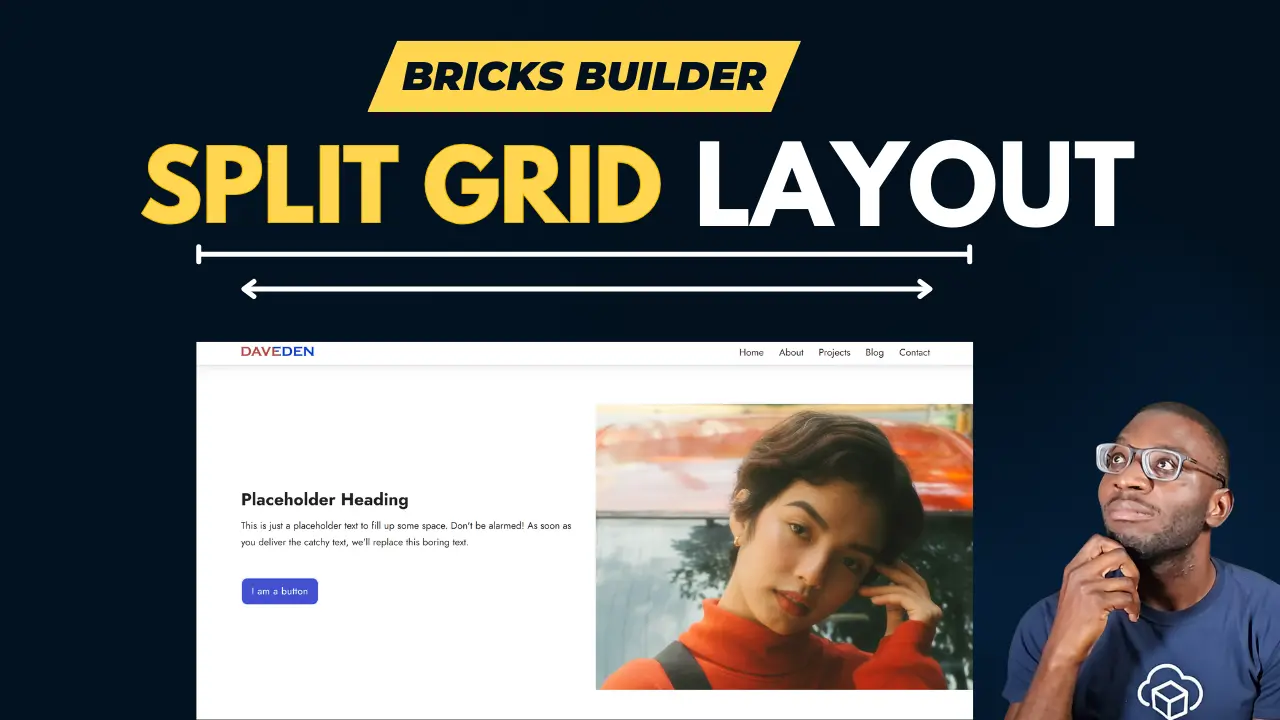
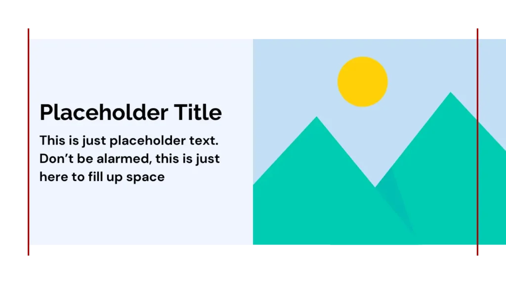
Let’s visualise our split grid setup. Picture a container split into two blocks:
- Content Block: Containing the heading, descriptive text, and a call-to-action (CTA). This block would align with the standard content area of your website.
- Image Block: Displaying your eye-catching image or video. This block stretches to the edge of the screen, maximising the impact of your imagery.
Structure and Naming Convention
To keep our code clean and scalable, we’ll use the BEM (Block, Element, Modifier) naming convention. Here’s the basic layout used in the example:
<section class="dd-split-grid">
   <div class="dd-split-grid__content-wrapper dd-split-grid__col1">
      <h3>Main Heading</h3>
      <p>Description</p>
      <a href="">CTA</a>
   </div>
   <div class="dd-split-grid__img-wrapper dd-split-grid__col2--full">
      <img src="" alt="Image Description"/>
   </div>
</section>
Understanding the CSS
Let’s break down the essential CSS properties to achieve our desired layout:
Parent Container (dd-split-grid)
Box-model properties:
- Padding Inline: 0
- Width: 100%
- Max-width: 100%
Grid Container Properties
- Display: Grid
- Column Gap: 0
- Row Gap: your desired row gap when stacked on mobile
- Grid Template Columns: (See next section for in-depth explanation)
Grid Template Columns: The Key to Flexibility
The grid-template-columns property is where we define our adaptable split grid. We use named grid lines to create a visual map for placing elements. Here’s the CSS
%root%{
  --dd-gutter: var(--dd-con-gutter);
  --dd-gap: var(--dd-grid-gap);
  --dd-content-width: 1360px;

  --dd-max-boxed-col: calc((var(--dd-content-width) - var(--dd-gap)) / 2);
  --dd-min-boxed-col: calc(50% - var(--dd-gutter) - var(--dd-gap) / 2);
  grid-template-columns;
  grid-template-columns:
    [full-start col1-full-start] minmax(var(--dd-gutter), 1fr)
    [col1-start content-start] min(var(--dd-max-boxed-col), var(--dd-min-boxed-col))
    [gap-start col1-end col1-full-end] var(--dd-gap)
    [gap-end col2-start col2-full-start] min(var(--dd-max-boxed-col), var(--dd-min-boxed-col))
    [col2-end content-end] minmax(var(--dd-gutter), 1fr)
    [col2-full-end full-end];
  grid-auto-flow: row dense;
}

:where(%root% > div){
  grid-column: content;
}
Grid Children and Utility Classes
Assign grid children to specific columns using the named grid lines. There are 6 named grid lines available:
grid-column: full;For a fullwidth child containergrid-column: content;For a content-width containergrid-column: col1;For Boxed First Columngrid-column: col2;For Boxed Second Columngrid-column: col1-full;For Stretched First Columngrid-column: col2-full;For Stretched Second Column
To simplify the application of the CSS, I’ve created utility classes for each grid column property as shown below:
.dd-split-grid__full{grid-column: full;}
.dd-split-grid__content{grid-column: content;}
.dd-split-grid__col1{grid-column: col1;}
.dd-split-grid__col2{grid-column: col2;}
.dd-split-grid__col1--full{grid-column: col1-full;}
.dd-split-grid__col2--full{grid-column: col2-full;}
Then we can simply apply the utility classes as needed.
Conclusion
You can consider varying your split grid layouts for added visual interest. In a future tutorial, we’ll explore how to create an uneven split grid layout. Please let me know in the comments if the code works for you!
Comments
No comments yet — be the first.
Leave a comment
Replying to .
Thanks — your comment is in
It's awaiting moderation and will appear after it's approved and the site is rebuilt.