Advanced two-column grid: Boxed content & stretched image

Introduction
In a previous tutorial, we explored using Elementor’s Flex Container to create an uneven two-column layout where the text column remains contained within the boxed content area while the image column extends to the edge of the screen.
We extend the idea in this tutorial but use the more flexible CSS Grid Layout. We will utilise
- Elementor Grid Container for the parent container,
- Elementor Flex Container for the child columns,
- CSS Variables to improve code maintainability,
- BEM Naming Methodology
- Custom CSS for the calculations.
How it works
First, create a standard full-width grid container and add the required child items. Then, control the grid-template-columns by referencing a CSS variable created using Custom CSS. Finally, we’ll set the grid-columns for each of the child items.
Install the latest version of Elementor
Before we begin, ensure that you have the latest version of Elementor and Elementor Pro.
It’s recommended to keep your version up-to-date for security patches and access to the newest features. At the time of writing this article, the current version of Elementor [Pro] is 3.17+.
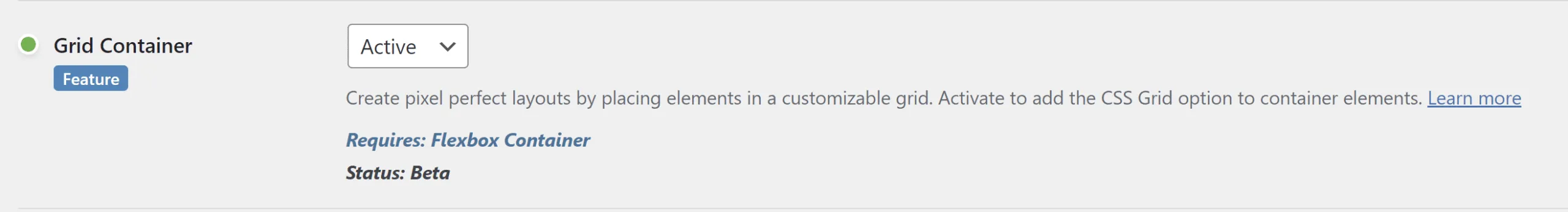
Activate the flex and grid container features
You’ll need to activate the Grid Container feature by navigating from your WP Dashboard to Elementor > Settings > Features and activate Grid Container.
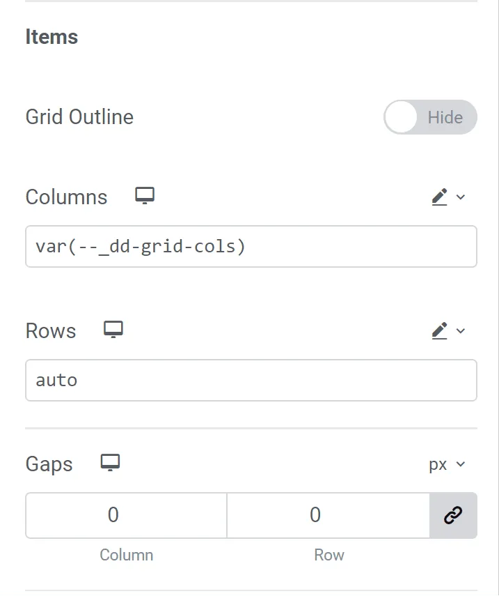
Parent Grid Container Properties
- On the parent container, change the content width from “Boxed” to “Full Width”.
- Leave the Width as 100%
- Set the ‘Columns’ to
var(--_dd-grid-cols)using the pencil icon and the ‘Rows’ toauto - On the mobile responsive view, set the ‘Columns’ to 1fr
- Set the [Column] Gaps to 0
- Set the Padding to 0
- Add a class name of “
dd-mixed-grid“
Child Grid Container Properties
For the child grid items, we’ll employ a BEM naming methodology to determine the position of the grid child item, as well as whether it is boxed or stretched.
The naming convention is as follows: the block name is “dd-mixed-grid“, then the element name can either be __col1 or __col2 depending on whether it should be in the first or second column. Finally, apply the modifier of either --boxed or --stretch depending on whether it is contained within the boxed area or extends to the edge of the screen. I show how it is implemented in the YouTube tutorial.
Custom CSS
Finally, apply some Custom CSS using your favourite method for organising your code snippets. The snippet is divided into two sections. The first section is the general CSS that would affect all the required sections on the page.
The second portion is the modifier CSS that is added to each section and controls the properties specific to each section.
Site-wide CSS
/*-- Site-wide CSS --*/
@media screen and (min-width:768px) {
.dd-mixed-grid {
    --_dd-content-size: var(--dd-content-size, 1140px);
    --_dd-gap: var(--dd-gap, 20px);
    --_dd-col1-pct: var(--dd-col1-pct, 40);
    --_dd-grid-padding: var(--dd-grid-padding, 10px);
    --_dd-col1-width: var(--dd-col1-width, min((var(--_dd-col1-pct) * (100% - var(--_dd-gap) - 2*var(--_dd-grid-padding)) / 100), (var(--_dd-col1-pct) * (var(--_dd-content-size) - var(--_dd-gap) - 2 * var(--_dd-grid-padding)) / 100)));
    --_dd-col2-width: var(--dd-col2-width, min(((100 - var(--_dd-col1-pct)) * (100% - var(--_dd-gap) - 2 * var(--_dd-grid-padding)) / 100), ((100 - var(--_dd-col1-pct)) * (var(--_dd-content-size) - var(--_dd-gap) - 2 * var(--_dd-grid-padding)) / 100)));
    --_dd-grid-cols: [full-start col1-stretch-start] minmax(var(--_dd-grid-padding), 1fr) [col1-boxed-start content-start] var(--_dd-col1-width) [col1-boxed-end col1-stretch-end space-start] var(--_dd-gap) [space-end col2-boxed-start col2-stretch-start] var(--_dd-col2-width) [col2-boxed-end content-end] minmax(var(--_dd-grid-padding), 1fr) [col2-stretch-end full-end];
    display: grid;
    grid-template-columns: var(--_dd-grid-cols);
    gap: 0;
    grid-auto-flow: row dense;
}

    :where(.dd-mixed-grid>.elementor-element) {
        grid-column: content;
    }

    /* Grid-Child Modifier Classes */
    .dd-mixed-grid__col1--boxed {
        grid-column: col1-boxed;
    }

    .dd-mixed-grid__col2--boxed {
        grid-column: col2-boxed;
    }

    .dd-mixed-grid__col1--stretch {
        grid-column: col1-stretch;
    }

    .dd-mixed-grid__col2--stretch {
        grid-column: col2-stretch;
    }

    .dd-mixed-grid__content {
        grid-column: content;
    }
}
Section-specific CSS
This CSS should be added to each parent section. Replace the selector keyword with a class name is you don’t have access to the Elementor Widget Custom CSS area
/*-- Section-specific CSS --*/
selector{
    /* --dd-content-max-width: 1140px */
    --dd-gap: 1em;
    --dd-grid-padding: 10px;
    --dd-col1-pct: 40;
}
Elementor typically resets the layout for mobile, so the design should be mobile-responsive. But you may need to add left and right padding to the grid for the mobile breakpoint.
Comments
No comments yet — be the first.
Leave a comment
Replying to .
Thanks — your comment is in
It's awaiting moderation and will appear after it's approved and the site is rebuilt.