

Introduction
The Elementor Call to Action (CTA) widget is a favourite among Elementor Pro users. It is packed with a lot of features which Imran explores in his youtube video.
One aspect that a lot of users struggle with is aligning the CTA button to the bottom. In this tutorial, we’ll look at how we can achieve it. You can check out the sample on my test website.
Applicable Scenarios
Scenario 1 – A CTA widget per column using Sections & Columns
For those still using the old sections and columns layout, we use a popular layout method: creating a section with multiple columns and then adding a CTA widget to each column.

Scenario 2 – Three CTA Widgets in a single column with custom widths using Sections and Columns
A better approach while using the sections and columns might be to apply custom widths to the individual CTA widgets and align them all in a single column to reduce the DOM size.

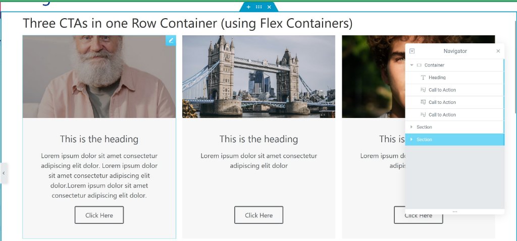
Scenario 3: Three CTA Widgets in one container set to row
The third scenario I highly recommend is activating the new flex container experiment under Elementor > Settings > Experiments. Add three CTA widgets to a single parent container set to flex-direction: row.
Custom CSS
Add this custom CSS to the parent section/container:
selector .elementor-widget-wrap{
  align-content: stretch;
}

selector .elementor-widget-call-to-action .elementor-widget-container{
    display: flex;
    height: 100%;
}

selector .elementor-cta{
    flex-direction: column;
    flex-grow: 1;
}
selector .elementor-cta__content{
    flex-grow: 1;
    flex-direction: column;
}
selector .elementor-cta__button-wrapper{
    margin-top: auto;
}