How to create a two-column layout: boxed-width content and stretched image

Table of Contents
Introduction
Have you ever wanted to create a two-column layout with an image that extends from the middle to the edge of the viewport, while keeping your text content neatly boxed and aligned with the other sections on the page? Look no further! In this tutorial, I’ll guide you through four different approaches to achieving this layout using Elementor.
If you view this section on a desktop screen, you’ll see the effect in action. You can also see other demos here:

Method 1: Using a two-column container
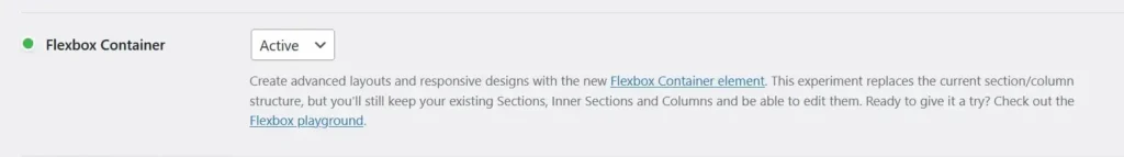
Before we begin, ensure you’ve enabled the Elementor Flexbox Container feature. It should be activated by default as of version 3.16. To confirm, go to your WordPress Dashboard, then Elementor > Settings > Features.
Parent Container Properties
With the Flexbox Container activated, return to your page in Elementor to create the two-column layout:
- Click the large plus icon in the Elementor Edit area
- Set the parent container properties as follows:
- Content width: Full Width
- Gap: 0
- Direction: Row
- Padding: 0

Adjust the justify-content property based on the location of the “boxed-content” column:
- If it’s on the left, set
justify-contentto"flex-end"; - if it’s on the right, set it to
"flex-start"

Boxed-Content container properties
- Add a CSS class name,
dd-boxed-col, to the inner container which you want to display as a “boxed” column - Set the padding to 0.
- Add the following custom CSS:
@media screen and (min-width: 768px){
.dd-boxed-col{
    --dd-content-width: 1140px; /* Adjust if your content width differs */
    flex-basis: min(50%, var(--dd-content-width) / 2);
}
Adjust the 768px in the media query to suit your needs. To break on tablet breakpoint, change the value to 1024px.
Update for Elementor 3.10 and above
Elementor 3.10 introduced Custom Units, simplifying custom width adjustments. To apply this to your “boxed-content” column:
- Under Layout > Width, click on the unit and select the pencil icon for Custom Units.
- Input
min(50%, 1140px / 2). This ensures responsiveness for tablet and desktop. Elementor already sets the default mobile width to 100%.

Method 2: Using a 2-Column Section
If you prefer using the older sections and columns, follow a similar approach to Method 1. Remember to change the content width and media query value (768px) as needed. Here’s how:

- Add a 2-column (50 / 50) section to your page.
- Set the Content Width to Full Width.
- Add a class name based on content placement:
dd-boxed--rightfor right placementdd-boxed--leftfor left placement.
- Finally, add this custom CSS to the section under Advanced > Custom CSS:
@media screen and (min-width: 768px){
    .dd-boxed--right > .elementor-container > .elementor-column:last-of-type, .dd-boxed--left > .elementor-container > .elementor-column:first-of-type{
        --dd-content-width: 1140px;
        flex-basis: min(50%, var(--dd-content-width) / 2);
    }
    .dd-boxed--right > .elementor-container{
        justify-content: flex-start;
    }
    .dd-boxed--left > .elementor-container{
        justify-content: flex-end;
    }
}
Method 3: Using the Image Box Widget
One of my favourite Elementor widgets is the Image Box widget, It is versatile for creating complex layouts with minimal DOM output. Here’s how to use it:
- Add the Image Box widget to a full-width section/container with “0” padding.
- Apply these properties to the Image Box:
- Edit Image Box > Content
- Image Size: Medium Large (or your preferred size)
- Image Position: Left or Right
- Edit Image Box > Style > Image
- Spacing: 0
- Width: 50%
- Edit Image Box > Advanced
- Add the CSS Class
dd-boxed--img-box
- Add the CSS Class
- Edit Image Box > Content
- Include this custom CSS:
@media screen and (min-width:768px){
.dd-boxed--img-box.elementor-widget-image-box .elementor-image-box-content{
    --dd-content-width: 1140px;
    width: min(50%, var(--dd-content-width) / 2);
    padding: 1em;
}
.dd-boxed--img-box.elementor-widget-image-box .elementor-image-box-img img{
    display: block;
    width: 100%;
}

Method 4: Using the CTA Widget
Another powerful Elementor tool is the CTA Widget (Elementor Pro). Here’s how to use it:
Add the CTA widget to a full-width section or container with zero padding. Then apply these properties to the CTA widget.
- Edit Call to Action > Content > Image
- Skin: Classic
- Position: Left or Right
- Edit Call to Action > Style > Box
- Alignment: Left or right
- Width: 50%
- Edit Call to Action > Style > Content
- Background-color: #fff0
- Add the CSS Class
dd-boxed--ctato the CTA widget - Use this custom CSS:
@media (min-width: 768px){
.dd-boxed--cta.elementor-widget-call-to-action .elementor-cta__content{
    --dd-content-width: 1140px;
    flex: 0 1 min(50%, var(--dd-content-width) / 2);
}
Conclusion
We’ve covered four methods to achieve the same layout. Feel free to experiment with each approach and discover your preferred approach. Let me know which one you like best in the comments!
please can you make a video tutorial on this for Method 2: Using A 2-Column Section i am trying to follow the instructions as mentioned but i am not able to achieve the desired result :( thank you!
Thanks for that.
Will this work also for a 60-40 containers ratio? for example the image container will be full width 60% and the text will be min(40%, 1140px / 2)
No, you’ll need to use a different technique. Check out this other tutorial – https://daveden.co.uk/tutorials/elementor-css-grid-create-a-flexible-boxed-stretched-two-column-layout/