Build a magazine-style loop grid in Elementor
Introduction
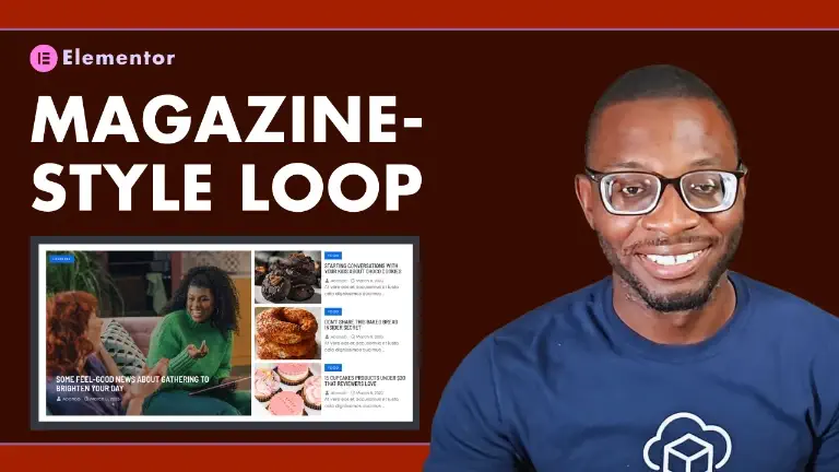
Are you tired of boring loop grids consisting of similar looking loop items? In this tutorial, you’ll learn how to build a magazine-style layout that captivates your readers from the get-go. Let’s get started.
Prerequisites
Before we dive in, ensure you have the latest version of Elementor Pro (v3.15 or higher) installed. Additionally, activate the Flexbox and Grid container features under Elementor > Settings > Features.
Watch the YouTube video above for the full step-by-step tutorial.
Creating the loop templates
Begin by creating the two essential loop templates, one for the featured post card and another for the rest of the posts.
Featured Loop Template
- Naming the template: Give your loop template a meaningful name like “Mag Featured Loop Template”
- Widget Insertion: Populate the loop with these widgets:
- Featured Image
- Container (for content wrapping)
- Heading widget (for the category label)
- Post title
- Post info
Ensure that the featured image width and height are set to 100%, and set a fallback image for cases where no image is assigned to a post.
Set the parent container’s Content Width to Full Width and padding to 0.
Custom CSS to Stack image and content
To stack the image and the content seamlessly, without relying on absolute positioning or CSS transform, set the parent container to Grid. Then set both the grid-template-columns and the grid-template-row to 1fr.
selector > div{
    grid-area: 1 / 1 / -1 / -1;
}
Custom CSS to make container full height
selector :is(.elementor-loop-container, .e-loop-item, .e-parent){
    height: 100%;
}
Choose your preferred method
Method 1
Create two separate loops grids. The first loop grid should have one column and one item per page, while the second grid should have one column and three items per page. For the second grid, apply an offset of 1 under Content > Query > Exclude > Offset.
Method 2
Use a single loop grid and apply the following custom CSS for a more efficient approach:
Custom CSS for single loop grid
selector .elementor-grid{
    grid-template-rows: auto;
}
@media screen and (min-width:1024px){
selector .elementor-grid{
grid-template-rows: repeat(3,auto);}

selector .e-loop-item:nth-of-type(1) {
    grid-column: 1 / span 1;
    grid-row: 1 / -1;}
}
Conclusion
And there you have it! By following these steps, you’ve successfully created a captivating Magazine-Style Loop Grid in Elementor. Your readers will now be drawn into your featured post before exploring the rest of your content. For a visual guide, check out the step-by-step YouTube tutorial.
Remember that engaging layouts can significantly enhance user experience. So, go ahead and experiment with different styles to find what resonates best with your audience. Happy designing!
Comments
No comments yet — be the first.
Leave a comment
Replying to .
Thanks — your comment is in
It's awaiting moderation and will appear after it's approved and the site is rebuilt.