
In this tutorial, you’ll be guided on creating a hero section layout that spans from the boxed content area to the edge of the screen using Bricks Builder. Follow the steps below to achieve this visually appealing layout.
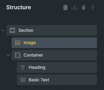
Add the necessary elements to the structure panel
In the structure panel, include the following elements: Section > Image + Container > Heading + Text widget
Define element properties
Section properties (Desktop breakpoint)
%root% {
    display: grid;
    gap: 0;
    grid-template-columns: minmax(var(--_padding), 1fr) min(100% - 2 * var(--_padding), var(--_content-width)) minmax(var(--_padding), 1fr);
    padding-left: 0;
    padding-right: 0;
    width: 100%;
    max-width: 100%;
    min-height: max(25rem, 100svh - var(--_header-height));
    position: relative;
}
Section Custom CSS
%root% {
    /* height of your header */
    --_header-height: 5rem;
    /* your section padding value */
    --_padding: 20px;
    /* boxed content width */
    --_content-width: 1200px;
}
Section properties (Mobile breakpoint)
%root% {
    display: flex;
    flex-direction: column;
    padding-left: var(--_padding);
    padding-right: var(--_padding);
}
Image Properties
Add the following properties to the image in the Desktop Breakpoint
%root% {
    width: 100%;
    height: 100%;
    position: absolute;
    z-index: -1;
    object-fit: cover;
    grid-column: 1 / -1;
    grid-row: 1 / -1;
}
For the mobile breakpoint, change the position from absolute to static
Container Properties (Desktop Breakpoint)
%root% {
    grid-column: 1 / -1;
    grid-row: 1 / -1;
    display: flex;
    flex-direction: column;
    align-self: end;
    width: 100%;
    max-width: 100%;
}
Heading and Text Element Properties
Specify your desired text colour and max-width. For example, use a max-width of 45ch.
Add decorative SVG shape
Include the following code in the Custom CSS for your Container.
@media screen and (min-width: 768px) {
    %root%::after {
        content: "";
        position: absolute;
        right: 0;
        bottom: 0;
        height: calc(100% - 3em);
        aspect-ratio: 1 / 1;
        background-color: #fff7;
        -webkit-mask-image: url('https://path/to/your/svg');
        mask-image: url('https://path/to/your/svg');
        -webkit-mask-size: contain;
        mask-size: contain;
    }
}
Make sure to replace the placeholder URL with the actual path to your SVG file. Also change the position values to suit your layout.
Conclusion
Follow these steps carefully to create a unique hero section using Bricksbuilder. If you have any questions, please leave them in the comments section.