It patches only the builder chrome — no dependencies, no tracking, and nothing about your live site changes.
59
enhancements
5
quick-start presets
WCAG 2.2
AA baseline
Zero
front-end changes
DesktopTabletMobile100%
Hero
<section>
Title <h1>
Image <img>
Actions <div>
Footer
<footer>
Insert image
A stylised view of the Builderius editor with the enhancements applied: a
top toolbar whose breakpoint switcher is a keyboard radio group with a
visible focus ring, a Navigator listing elements with their HTML tags, a
selected element on the canvas showing a focus ring and an accessible
tooltip, and a keyboard-operable bottom toolbar.
Current stable release · 2.0.3
What’s new in DBE 2.0.3
Version 2.0.3 adapts DBE to Builderius 1.3.6-beta, adds direct element actions on the preview
canvas and reduces the amount of code loaded into each builder session.
Open the familiar element action menu from a rendered element with right-click or Shift+F10, then rename its Navigator label there or with F2 without changing visible text or its HTML tag.
DBE now extends the builder’s native admin bar, canvas tabs, change history, rename, Auto-BEM, CSS workflow, context menu and saving instead of loading overlapping replacements.
Accessibility
Native controls, complete keyboard models
The admin bar, persistent canvas tabs, favourites editor, element menus and Wrap in dialog gain clear names and states, contained focus where needed and reliable focus return.
Reliability
Fewer surprises while you work
Store-backed features now work with Builderius Free alone, requested documents stay selected, and the left and right panels remember independent widths.
Performance
Load only what you switch on
The builder runtime is deferred and split into feature chunks, so DBE transfers and executes only the JavaScript required by your enabled enhancements.
Builderius is one of the most capable, standards-minded page builders for WordPress.
But like any tool you spend all day inside, the builder interface itself has
rough edges: icon-only buttons with no labels, a handful of controls that keyboard and
screen-reader users cannot reach, a Navigator that could scan more easily, and no light
theme if that is how you prefer to work.
Daveden Builder Enhancements smooths those edges. It is a collection of
small, optional improvements to the Builderius builder — the editing chrome, not
the sites you build with it. Everything is a toggle: turn on only what you want and leave
the rest off.
Built the Daveden way
A few principles run through every feature.
WCAG 2.2 AA is the floor
Contrast, visible focus, target sizes and screen-reader semantics are treated as requirements, not nice-to-haves.
Keyboard first
If you can do something with a mouse, you should be able to do it with a keyboard — using the arrow-key patterns you would expect.
Native semantics before ARIA
Real roles and real names, following the ARIA Authoring Practices Guide only where a custom widget genuinely needs it.
No lock-in
It patches the builder from the outside, so you can switch any feature off at any time and nothing about your templates changes.
Comfortable to work in
Light or dark, comfortable or compact — the builder can follow your operating system or be pinned exactly the way you like it.
Accessibility is the point
A builder should be usable by everyone who works in it
These features are not an afterthought bolted onto a theming plugin; they are the reason
it was written. Every one is purely additive — the builder’s own behaviour is untouched.
Tooltips & accessible names
Around 25 icon-only buttons ship with neither a hover tooltip nor a proper name. This gives each one both, so a screen reader announces what it does.
Focus visibility
A clear focus ring on every interactive control, as WCAG 2.4.7 requires.
Top-bar keyboard groups
Turns the breakpoint switcher into a real radio group — it announces which breakpoint is current, and arrow keys move and select it from a single Tab stop — and labels the canvas width and zoom fields.
Bottom-bar keyboard toolbar
Makes the row of editor tools (Custom CSS, JavaScript, Dynamic Data, Sense AI and so on) a proper keyboard toolbar: one Tab stop, arrow-key navigation, each tool announcing whether its panel is open, and locked Pro tools announced as locked rather than sitting there as silent, dead buttons.
Accessible select comboboxes
Gives the builder’s custom dropdowns proper combobox / listbox / option roles, a single Tab stop, and arrow keys with Enter to choose.
Accessible AI session tabs
Wires the Sense AI terminal’s session tabs as a real tab list — each announcing which session is active, arrow keys to move and switch, the terminal exposed as their panel — and turns the “new session” button and its agent picker into a proper, keyboard-operable menu.
Preview overlay contrast fix
Corrects the hover and selection overlay labels so you can tell the two apart and both meet AA contrast.
Inside DBE 2.0
See the new workflows in Builderius
These screenshots show the DBE 2.0 interface in use. Watch the walkthrough,
then explore the new tools and improvements in context.
A dashboard built for every feature
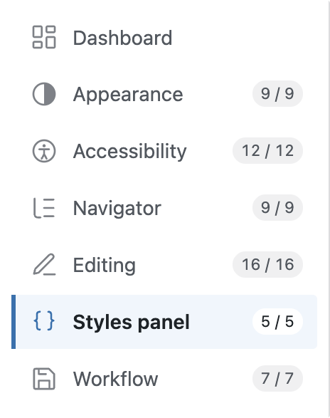
The settings screen groups all 59 enhancements by area, keeps feature counts visible and makes each section easy to reach.
DBE 2.0
A clearer, more useful Navigator
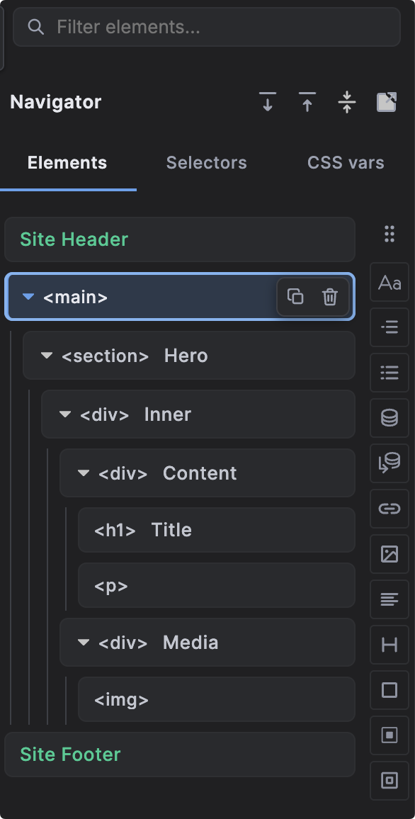
Search, expand and collapse controls, HTML tag badges and row actions make a real page structure easier to scan and work with.
DBE 2.0
Navigator actions where you need them
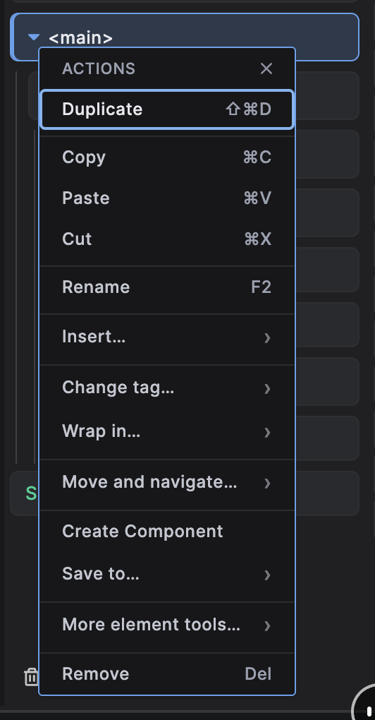
The flatter right-click menu brings common actions forward and groups insertion, movement and advanced tools into focused submenus.
DBE 2.0
A searchable command palette
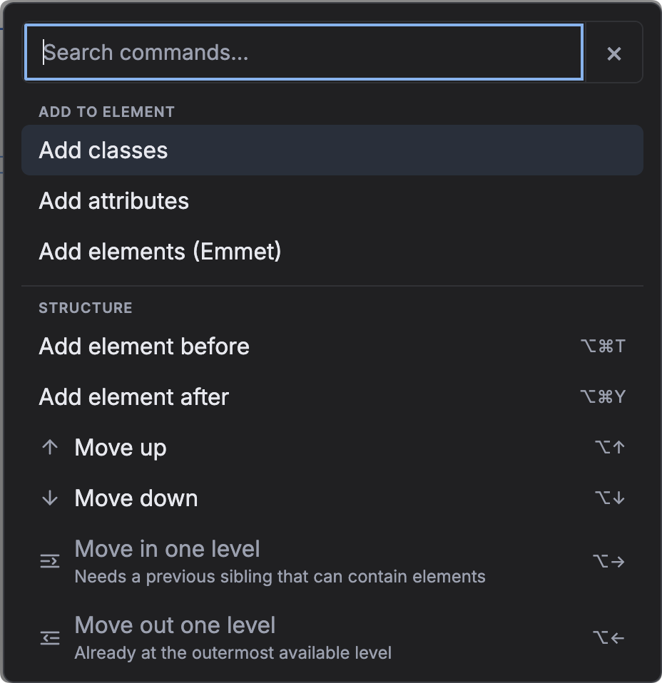
Cmd/Ctrl+K opens element, structure and navigation actions in one keyboard-friendly place, including Emmet-like element creation.
DBE 2.0
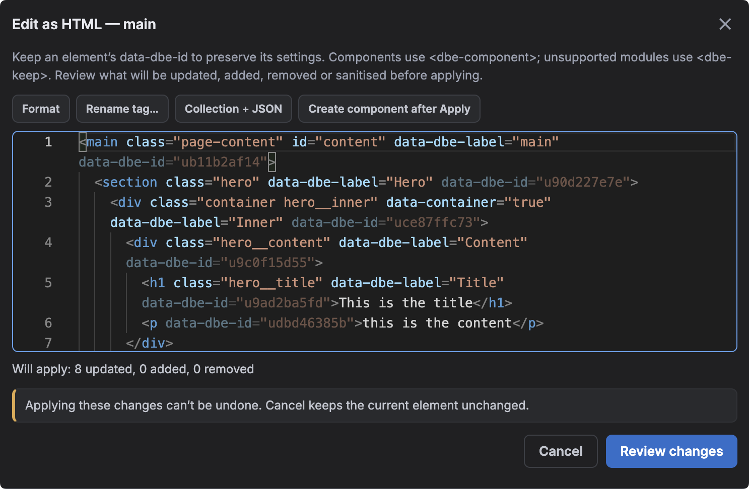
Edit a subtree as real HTML
Edit as HTML presents readable markup, preserves Builderius data and previews what will change before anything is applied.
DBE 2.0
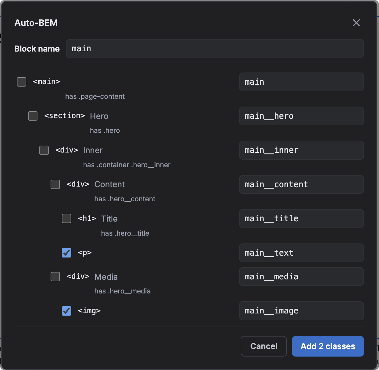
Auto-BEM class suggestions
Generate consistent block and element class names for a selected subtree, edit the suggestions and choose exactly which classes to add.
DBE 2.0
The full toolkit
Explore all 59 enhancements
Start with the part of Builderius you want to improve. The documentation keeps the complete,
current feature list and explains what each switch changes.
In WordPress go to Plugins → Add New → Upload Plugin, choose the
zip and install it (or unzip it into wp-content/plugins/).
Activate “Daveden Builder Enhancements”, then open Builderius —
the enhancements appear in the builder chrome.
One thing to watch
The plugin folder name must contain builderius — keep it
as daveden-builderius-enhancements. Rename it and the builder features
silently do nothing.
Updates arrive the normal way: new releases show up on your WordPress
Plugins screen, ready to update in one click. Check the changelog before you update.
Free, and staying free
Support the plugin and the channel
Daveden Builder Enhancements is free and GPL-2.0, and the tutorials behind it are free too. There is no paid tier and there never will be — but if the plugin has saved you time, you can put something towards the hours that go into it.
No pressure either way — sharing a tutorial or opening a good issue
helps just as much.
Feature requests welcome
Help shape the roadmap
Daveden Builder Enhancements is built in the open and released under GPL-2.0. Missing
something, or hit a rough edge? Open an issue on GitHub — feature requests and bug reports
both go straight onto the roadmap, and the next release is shaped by the people who use it.